 SharePoint Elegance
Documentation
Home/Documentation
Accordion Component
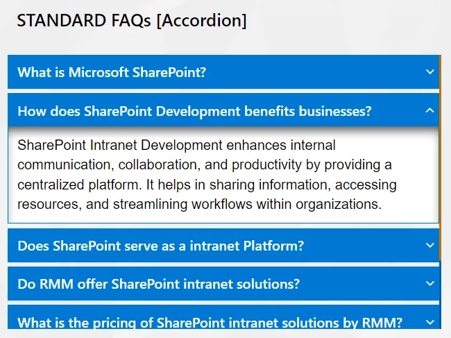


Optimize your page space with our Accordion component, featuring dynamic content construction for multi-purpose use. This flexible tool allows administrators to organize complex information into expandable panels with easy audience targeting configurations.
- Enable Multiple Tab Expand: Option to enable opening multiple tabs or not.
Best suitable for:
- FAQs
- eBooks
- KB Articles
- Instruction Manuals
Album Component
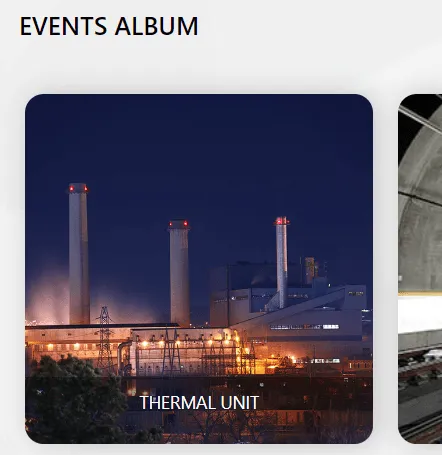


Our Album component displays beautiful thumbnail galleries, grouping multiple photos by specific events for a streamlined visual experience. It features simple management options to record album-specific details and control how your media is showcased.
- Display Type: Option to render the album intuitively with a range of display
choices, including:
- Classic
- Grid
- Slider
Best suitable for:
- Events/Occurrences Images Collection
- Products Catalog
- News Images Gallery
- Project specific photos
Banner Slider Component
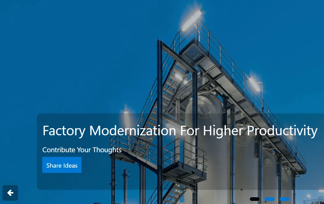


The Banner Slider component enables full-width, end-to-end image displays on SharePoint pages for maximum visual impact. It includes easy-to-configure slide text and call-to-action buttons, ensuring a 100% responsive and adaptive experience on any device.
- Auto Slide: Enable or disable automatic sliding.
- Transition Speed: Adjust slide duration and delay intervals.
- Navigation Controls: Option to show or hide arrows and dots.
- Navigation Arrow Alignment: Display navigation buttons based on the banner
layout. Options include:
- Bottom
- Middle
- Target URLs: Each banner can link to a specific page or external site.
Best suitable for:
- Announcements
- Home Slider Option
- Products Catalog
- News & Events Display
- Project Photos
Date Carousel Component

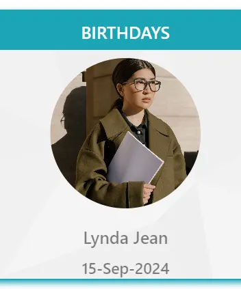

Celebrate your team with the Date Carousel component, which automatically populates employee birthdays and anniversaries from a SharePoint list. It offers multiple display styles and dynamic settings to showcase personalized celebration messages.
- Show Date Range: Pull date details from today to the next specific number of days (default is 7 days).
- Slide Duration: Set the slide idle timing for image display (default is 5 seconds).
Best suitable for:
- Date Display
- Anniversary Display
- Date-based Image Display
- Org Milestones Display
- Date-based Slideshow
Calendar Component
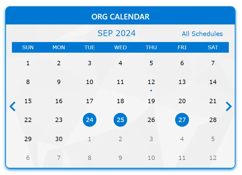

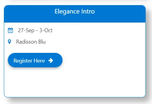
The Calendar component provides a clear, date-based display of company events or project schedules. It features a summary view for daily or monthly planning, making it the ideal tool for tracking important organizational dates and reminders.
- Category Filter: Select events based on specific category conditions and values.
Best suitable for:
- Events Calendar
- Department Calendar
- Day/Month Planner
- Date-based reminders
Cards View Navigation
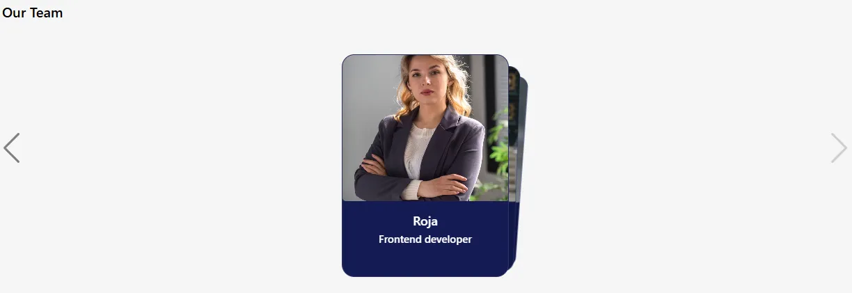
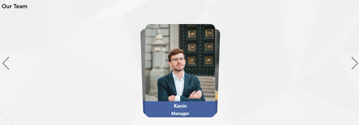

Cards View Navigation provides a clean, modern way to browse content in a card-based layout for modern SharePoint Online intranets. Each card displays a title, image, and supporting text, enabling quick access to key intranet pages and resources.
- Data Binding: Connect cards to any SharePoint list or library.
- Card Style Options: Choose card backgrounds, layouts, and themes.
- Image & Icon Support: Display thumbnails, icons, or images.
- Action Target: Open SharePoint pages, internal routes, modals, or external links.
Best suitable for:
- Team Member Cards
- Department Navigation
- Quick Links Panel
- Project or Category Cards
- News & Announcements
- Policy & Document Shortcuts
- Application / Tool Launchpad
- Knowledge Base Categories
- HR Services & Forms Access
- Training & Learning Modules
- Events & Campaign Highlights
- Employee Benefits Overview
- Location / Office Information Cards
- Vendor or Partner Directory
Countdown Timer
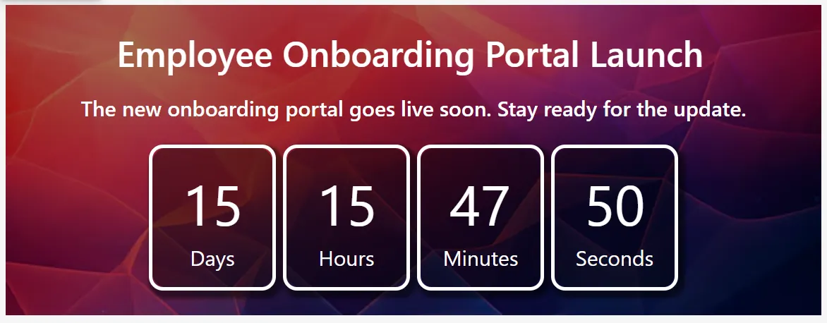
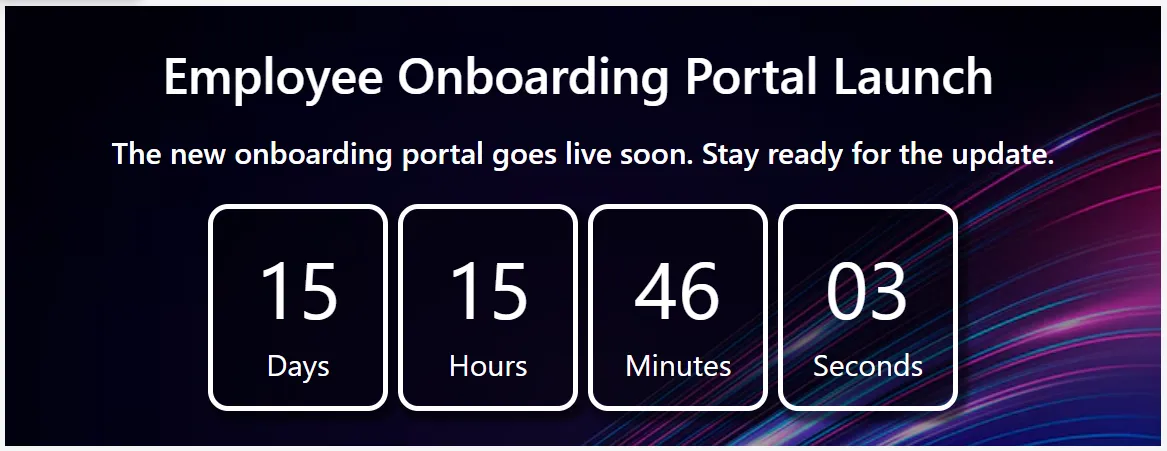
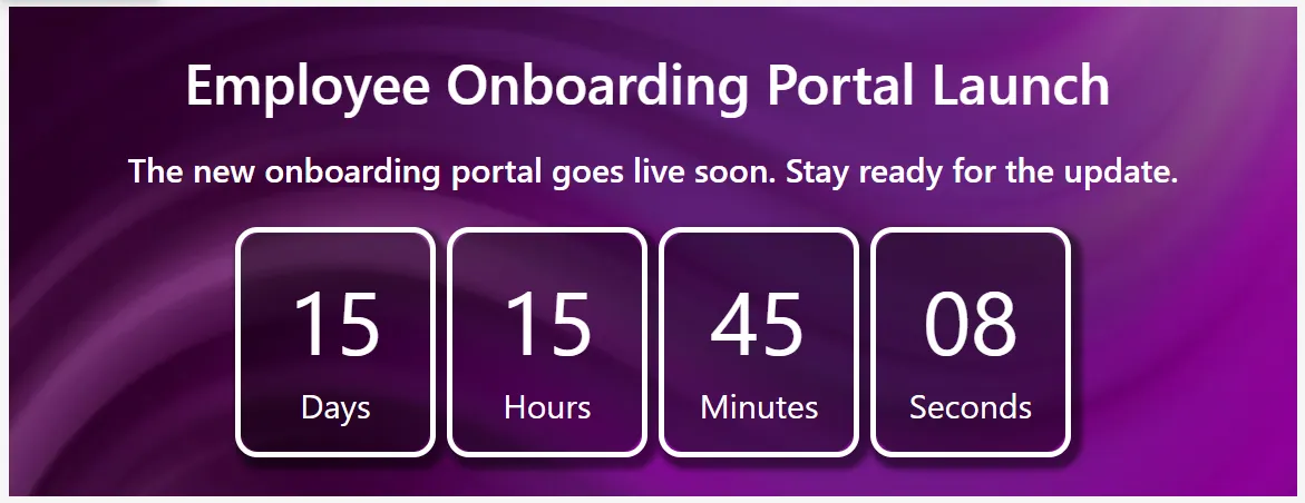
Create urgency and build excitement with our dynamic Countdown Timer web part for SharePoint intranet sites. This component displays remaining Days, Hours, Minutes, and Seconds in a modern card layout based on a target date. It is ideal for launch announcements, project go-live dates, webinars, or internal milestones.
- Title: Primary heading displayed above the countdown.
- Secondary Text: Optional subtitle or announcement message.
- Launch Date: Target date and time for the countdown logic (supports count-up if date is in the past).
- Post Action: Action after countdown reaches zero, such as a splash message, redirect, or hide the web part.
- Redirect Link: Destination URL for redirection when the post-action is set to redirect.
- Banner Images (1-3): Background images to enhance visual appeal in the countdown layout.
- Display Order: Controls sorting in multi-item scenarios or lists.
- Status: Active or Inactive toggle to control visibility.
Best suitable for:
- Product Launch Countdown
- Intranet Portal Release / Go-Live Timer
- Event or Webinar Countdown
- Project Go-Live Announcement
- Training Program Start Timer
- Organization Milestone / Anniversary Countdown
Content Box
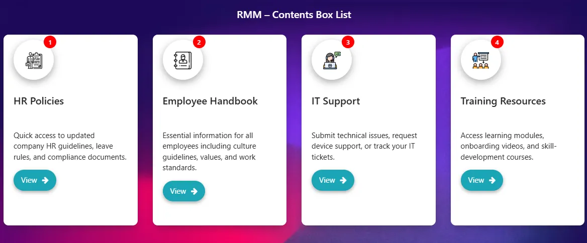
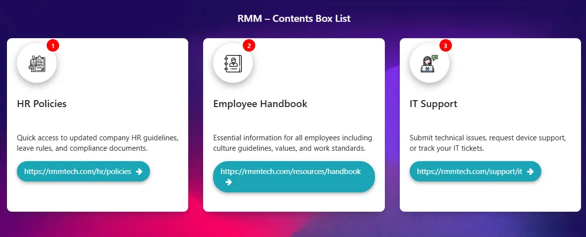
Our Content Box Cards provide dynamic, clickable navigation to make your SharePoint intranet fast and intuitive. Each card features an eye-catching icon, bold title, concise description, and a clear action button. Everything is pulled live from a single SharePoint list, allowing administrators to update, reorder, add, or hide items instantly without editing the page.
- Title: Main heading or card name (e.g., "Leave Policy", "IT Helpdesk").
- Description: Short supporting text (1-2 sentences) shown below the title.
- Icon URL: Link to custom icon or image (PNG, SVG, Fluent UI icon, or emoji).
- Redirect Link: Destination URL for internal SharePoint pages, documents, or external sites.
- Button Text: Label on the call-to-action button (e.g., "View Details", "Download").
- Badge Number / Order: Optional badge for tags like "New" or "Hot" and custom sorting.
- Background Style: Custom card background using solid colors, gradients, or subtle images.
- Display Order: Numeric value to control the sequence of cards.
- Status: Active or Inactive toggle to show or hide the card.
Best suitable for:
- HR Policies & Forms Quick Access
- Employee Handbook Navigation
- IT Support & Self-Service Shortcuts
- Training & Learning Catalog
- Department & Service Hubs
- Quick Links Dashboard / Employee Essentials
- Resource Library Categories
Coverflow Navigation

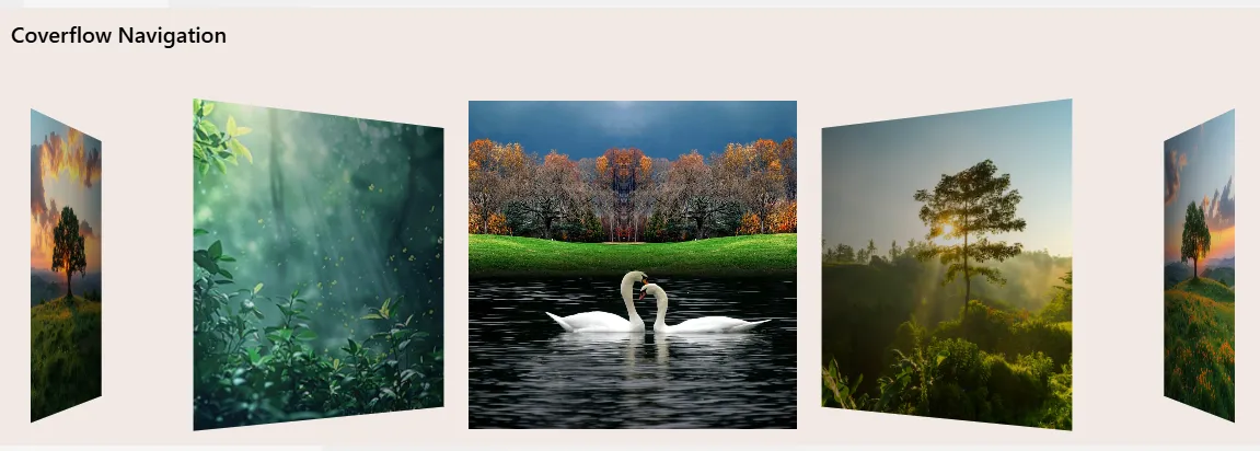
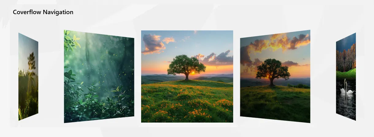
Elevate your SharePoint intranet with interactive 3D-style Coverflow navigation. This component highlights featured pages, internal campaigns, news, or curated content in a smooth, horizontal carousel. With centered focus and perspective depth, it provides a premium visual experience for content discovery.
- Category Filter: Show items from specific categories only (e.g., News, Campaigns, Events).
- Auto Rotate: Enable automatic gentle cycling through items.
- Center Focus: Keep the active item prominently centered with visual emphasis.
- Banner Images: Upload or link high-quality images for each coverflow card.
- Display Order: Numeric sorting to control the sequence of items.
- Status: Active or Inactive toggle for individual item visibility.
Best suitable for:
- Homepage Featured Navigation
- Internal Campaign Highlights
- Department or Business Unit Showcases
- Announcement & Promotion Banners
- Curated Content Discovery
Events
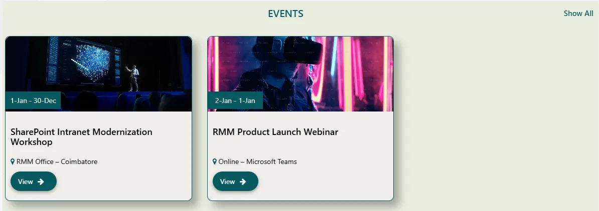
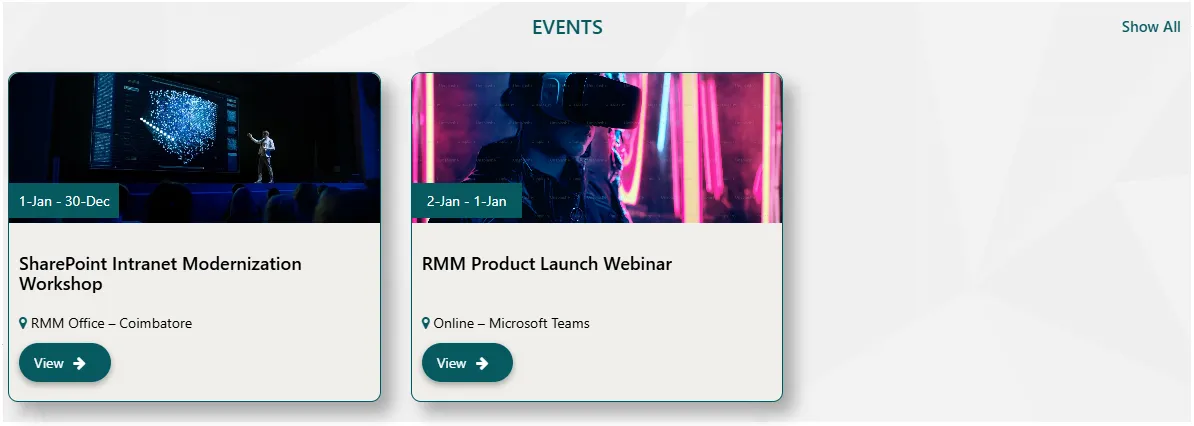
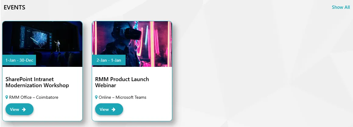
Keep your organization informed with an engaging Upcoming Events showcase for your SharePoint intranet. Spotlight workshops, webinars, training sessions, town halls, and product launches. Powered by a SharePoint list, it automatically surfaces relevant future events with crisp cards showing the date, time, venue, and one-click access to registration details.
- Date Range: Show events starting from today, within the next X days/weeks, or between custom dates.
- Status: Filter visibility using Active, Expired, or custom tags like "Live Now".
- Category: Group events by department or type (Webinar, Training, All-Hands).
- Display Order: Sort by earliest date, featured priority, or manual numeric order.
- Status Toggle: Enable or disable individual event items without deletion.
Best suitable for:
- Internal Training & Learning Sessions
- Product or Feature Launch Events
- Company-wide Announcements
- Town Halls & Leadership Meets
- Webinars & Knowledge Sharing Programs
- Team Building & Social Events
- Employee Recognition & Awards Ceremonies
- Holiday & Cultural Celebrations
- Onboarding & New Joiner Welcome Events
Grid Links Navigation
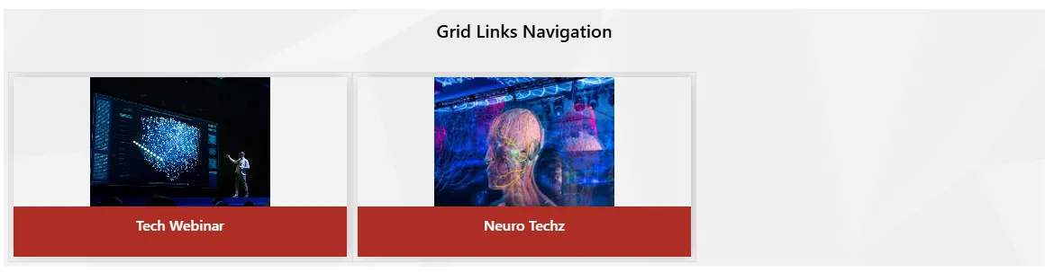
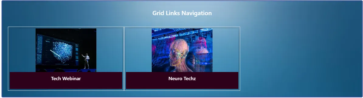
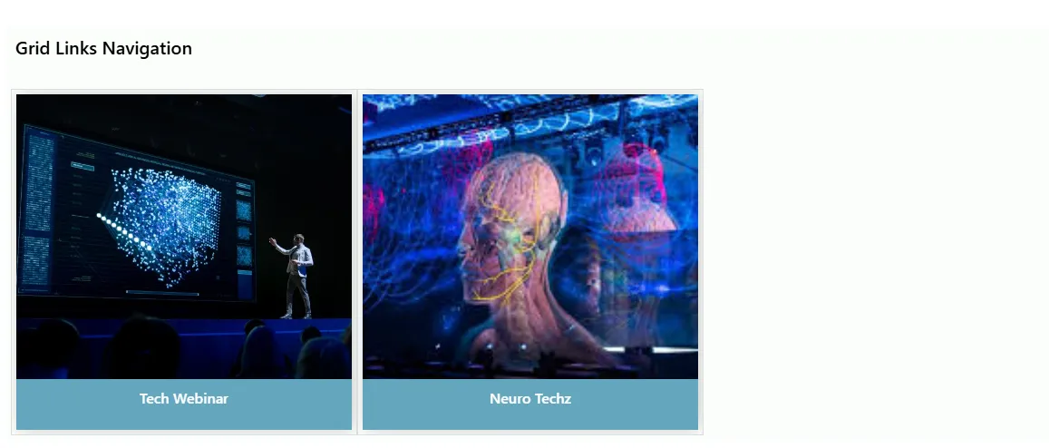
The Grid Links Navigation component presents image-based shortcut tiles in a responsive grid layout, enabling quick access to key intranet pages, tools, and business resources. Content is dynamically driven from a SharePoint list for easy administration.
- Grid Columns: Configure a responsive column layout for different screen sizes.
- Link Target: Open links in the same tab or a new tab.
- Image / Icon: Visual asset displayed for each grid navigation tile.
- Redirect URL: Set the destination page or external link for the tile.
- Display Order: Control the sequence of icons within the grid.
- Status: Toggle visibility for individual navigation items.
Best suitable for:
- Department Navigation Panels
- Tools & Applications Access
- Quick Access Dashboards
- Service & Resource Hubs
- Frequently Used Intranet Links
Team Members Slider



The Team Members Slider component presents employee profiles in a clean, responsive slider layout. It displays profile images, names, and roles, helping users quickly identify leadership teams or department members. All content is dynamically managed from a SharePoint list.
- Profile Image Style: Choose between circular or square image formats.
- Name: Display the employee or member's full name.
- Role / Title: Visibility control for job titles and designations.
- Profile Link: Connect to an internal profile page or external LinkedIn profile.
- Display Order: Control the sequence of team members in the slider.
- Status: Enable or disable individual profile visibility.
Best suitable for:
- Leadership & Management Showcases
- Department or Project Teams
- Employee Directory Highlights
- New Joiner Introductions
- Organization Structure Overview
3D Slider

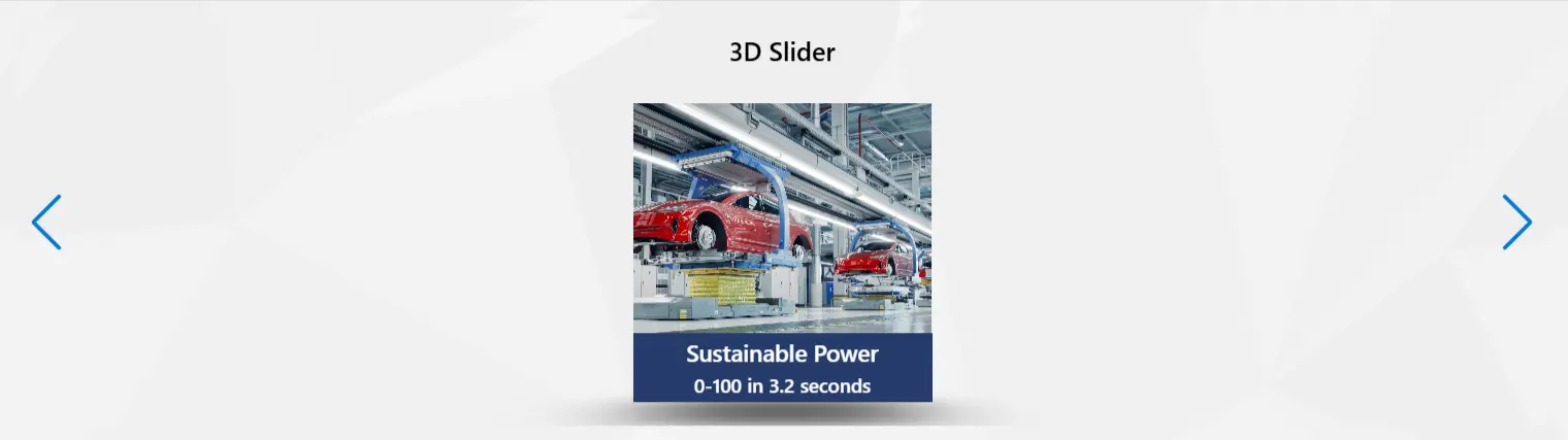
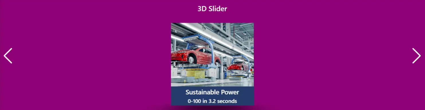
Transform your SharePoint intranet with a visually stunning 3D Slider that presents content in a rotating depth-effect carousel. Each slide features an image, title, and description, delivering a premium browsing experience. All content is managed from a SharePoint list, making updates fast and effortless for administrators.
- Title: Main heading displayed above the 3D slider.
- Title Alignment: Align the component title to the Left, Center, or Right.
- List Name: Name of the SharePoint list that provides slide data (e.g., RMM – 3D Slider).
- Category Filter Values: Comma-separated categories to filter which items are displayed.
- Auto Play Slider: Enable or disable automatic slide rotation (Yes/No).
- Show Navigation Arrows: Toggle visibility of previous/next navigation arrows.
- Slide Timing Duration: Set the auto-play interval in seconds for each slide.
- CSS Depth: Control the 3D depth perspective effect applied to non-active slides.
Best suitable for:
- Homepage Featured Content Showcase
- Product or Campaign Highlights
- Department Spotlights
- News & Announcements Display
- Training & Knowledge Content Carousel
- Internal Awards & Recognition Showcase
Gallery
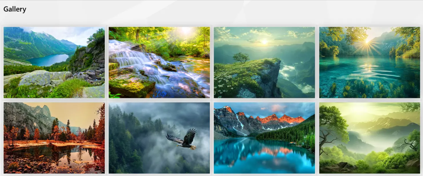
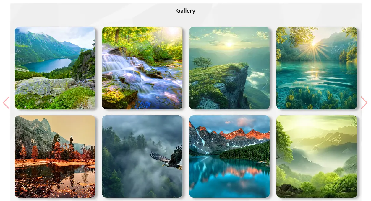
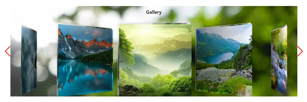
Flaunt event photos, corporate media, and visual content with a stunning Gallery component for your SharePoint intranet. Powered by a SharePoint list, it renders images in multiple display modes including stacked masonry and grid layouts. Administrators can control rows, columns, category filters, and depth settings – all without touching page code.
- Title: Heading displayed above the gallery.
- Title Alignment: Align the title to Left, Center, or Right.
- List Name: SharePoint list providing the gallery images (e.g., RMM – Gallery List).
- Category Filter Values: Comma-separated category values to filter the displayed images.
- Display Type: Choose between layout options such as:
- Stack (masonry-style stacked layout)
- Grid (uniform grid layout)
- Total Cells In A Row: Number of image columns per row in the grid display.
- CSS Depth: Adjust visual depth or shadow effects for the gallery container.
Best suitable for:
- Corporate Event Photo Albums
- Employee Engagement & Activities Gallery
- Office & Facility Showcase
- Product or Brand Imagery
- CSR & Community Initiatives
- Award & Recognition Ceremonies
- Training & Workshop Highlights
Image Links



The Image Links component provides visually engaging, full-width navigation banners that link to key intranet pages or external resources. Each image tile displays a title overlay and redirects users on click, making it an intuitive way to guide navigation through pictures. Content is driven from a SharePoint list for centralized management.
- Title: Component heading displayed above the image links.
- Title Alignment: Align the title to Left, Center, or Right.
- List Name: SharePoint list that supplies image and link data (e.g., RMM – Images Navigation List).
- Category Filter Values: Comma-separated categories to filter displayed image links.
- Show Link Title Text: Toggle visibility of the title text overlay on each image tile (Yes/No).
- Default Image Relative URL: Fallback image path used when no image is provided for a list item.
- CSS Depth: Control visual depth effects for the image link container.
Best suitable for:
- Department or Business Unit Navigation
- Campaign & Promotion Banners
- Quick Access to Key Intranet Pages
- Product or Service Category Links
- Policy & Document Section Shortcuts
- Homepage Visual Navigation Tiles
- Event & Initiative Highlights
Kindle
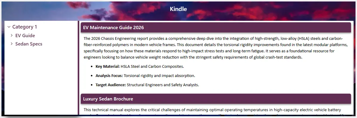
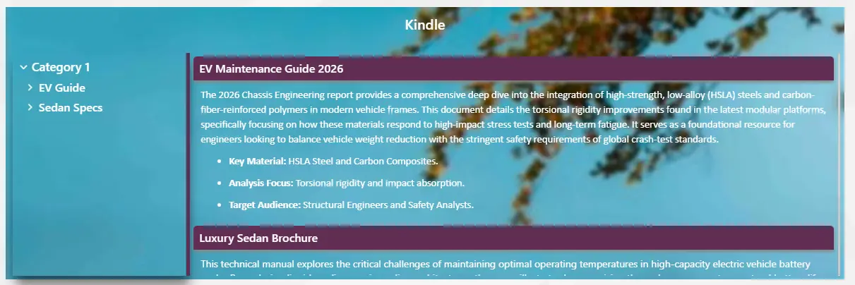
Generate professional user manuals and structured knowledge bases with the Kindle component for SharePoint intranet. It renders a tree-navigation panel on the left and a rich content detail view on the right, mimicking a document reader experience. All categories, articles, and content are sourced from a SharePoint list, enabling non-technical teams to manage documentation without any coding.
- Title: Heading displayed above the Kindle reader component.
- Title Alignment: Align the title to Left, Center, or Right.
- List Name: SharePoint list that provides the document tree and content (e.g., RMM – Kindle List).
- Category Filter Values: Comma-separated categories to filter the document tree entries.
- Display Type: Choose between layout styles such as:
- Slim (compact, minimal reader layout)
- Full (expanded, richly styled layout)
- CSS Depth: Visual depth or elevation effect for the component panel.
- Follow SharePoint Margin: Align the component to the page’s built-in SharePoint content margin.
- Web Part Background: Custom background color or image URL for the entire component.
- Heading Text Color: Text color for the component’s main heading.
- Left Pane Background Color: Background color of the tree-navigation sidebar.
- Left Pane Text Color: Text color for tree items in the left navigation pane.
- Detail View Background Color: Background color of the content detail panel.
- Detail View Heading Color: Color for headings within the detail content area.
- Detail View Text Color: Body text color in the detail reading area.
- Detail View Border Color: Border color separating the left tree and right detail panels.
Best suitable for:
- Employee Handbooks & Policy Manuals
- IT & Technical Documentation
- Knowledge Base & FAQ Repositories
- Product & Service User Guides
- Onboarding & Training Modules
- Compliance & Governance Documentation
- Standard Operating Procedures (SOPs)
- eBooks & Internal Learning Resources
Model Terms Box
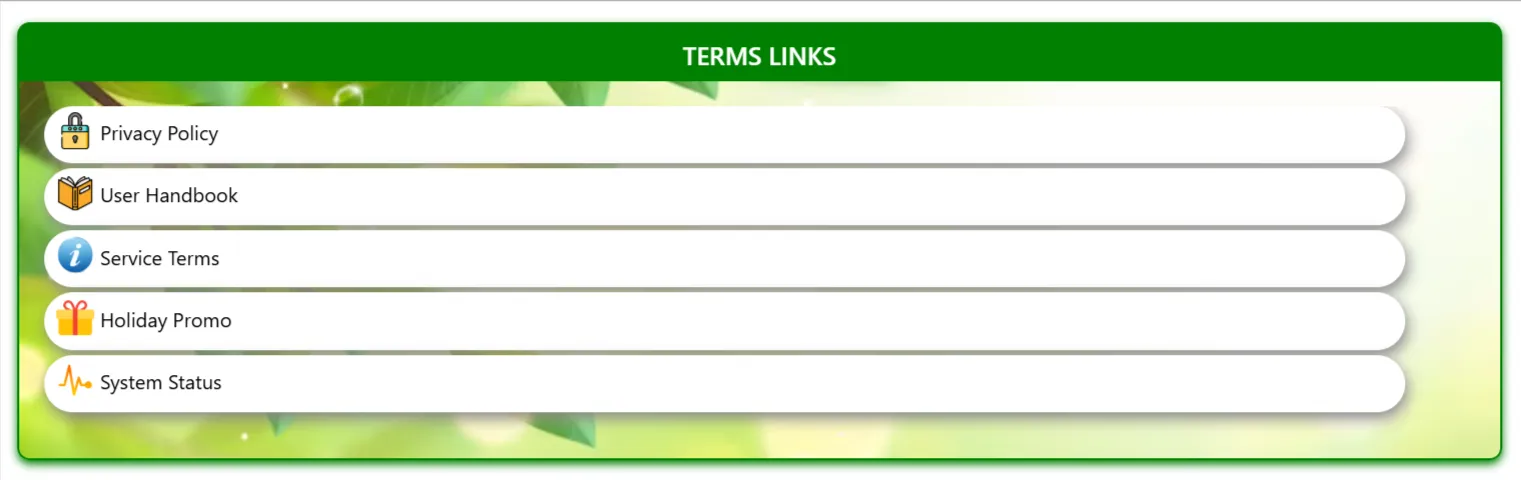
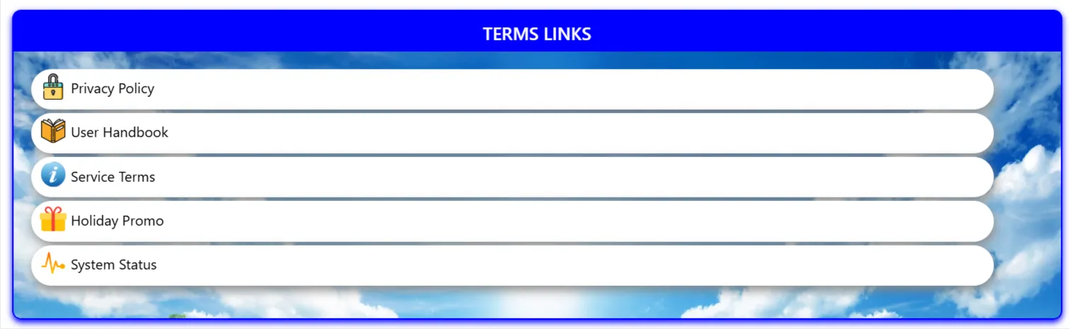
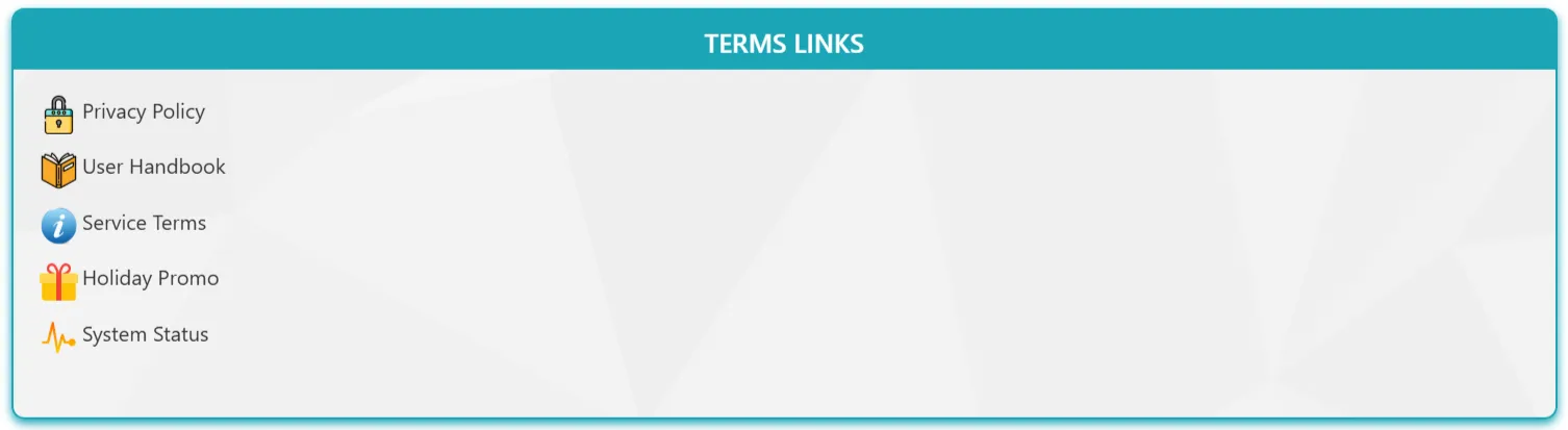
Ensure legal compliance and policy clarity with the Model Terms Box component. This tool allows admins to display categorized legal terms, company policies, or glossaries in a structured, searchable box format. It mimics a professional document reader experience, making it easy for users to find and reference important governance information.
- Category Filter Values: Filter terms or policies by specific department or type.
- Search Enabled: Toggle the internal search bar for quick keyword lookup.
- Tree Navigation: Enable or disable the sidebar navigation for multi-category displays.
Best suitable for:
- Privacy Policies & Terms of Service
- Company Handbooks & Glossaries
- Compliance Guidelines & Governance Docs
- Departmental SOPs
New Joiners Carousel
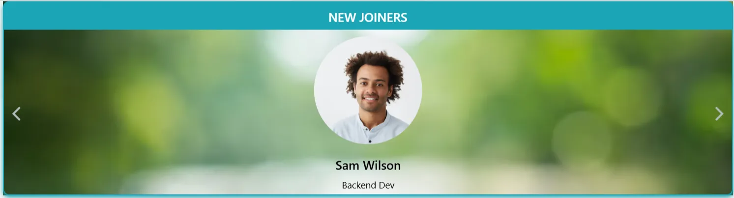
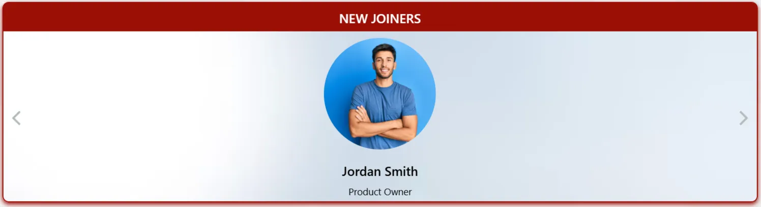
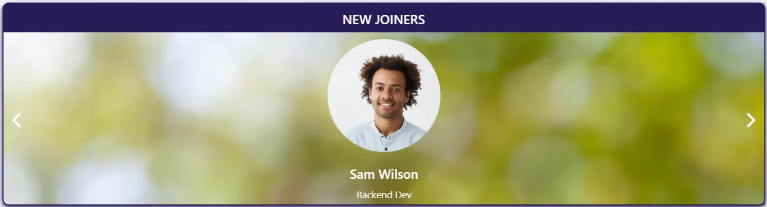
Welcome your newest team members in style with the New Joiners Carousel. This dynamic web part automatically highlights recent hires, showcasing their profiles, roles, and a warm welcome note. It's a key tool for building a positive company culture and ensuring new employees feel recognized from day one.
- Display Days: Control how long a new joiner remains featured in the carousel.
- Profile Fields: Choose to display Name, Job Title, Dept, and Join Date.
- Auto-Play: Enable automatic cycling through profiles.
Best suitable for:
- HR Welcome Portals
- Intranet Homepages
- Department News Sections
- Onboarding Recognition
Our Team



The Our Team component provides a premium, organized layout to introduce your leadership teams and key personnel. Each profile can include a professional photo, contact information, and role description, making it easy for employees to identify and connect with the right team members across the organization.
- Layout Options: Choose between Grid, Slider, or list-based profile displays.
- Contact Detail Toggle: Show or hide email and LinkedIn profile links.
- Bio Text Length: Control the amount of profile text shown in the summary view.
- Social Link: LinkedIn option.
Best suitable for:
- Leadership & Executive Pages
- Department Directories
- Project Team introductions
- Expert Hubs
Footer Component




Process Navigation
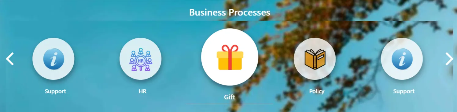
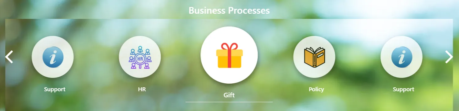
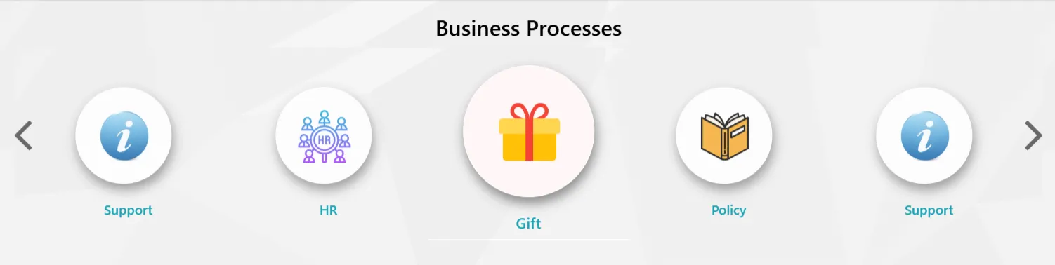
Process Navigation is designed to guide employees through complex, multi-stage journeys. Whether it's onboarding or a specific approval flow, this visual aid ensures users always know where they are in the process.
- Step Management: Add unlimited steps via SharePoint list.
- Status Indicators: Visual cues for Active, Completed, and Pending phases.
- Icon Support: Assign unique Fluent UI or SVG icons to each milestone.
Best suitable for:
- Employee Onboarding Journeys
- Procurement & Approval Workflows
- Project Phase Visualization
Quick Launch
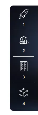
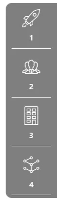
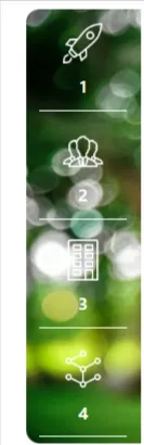
The Quick Launch component acts as a high-density portal for your organization's most essential tools and resource categories. It provides a sleek, space-saving vertical navigation experience.
- Iconography: Full support for modern icons to improve visual recognition.
- Animation: Animation of the starter launch.
- Audience Targeting: Ensure users only see links relevant to their department or role.
Best suitable for:
- Sidebar App Launchers
- Resource Center Navigation
- Department Shortcut Hubs
Quotes Component



Humanize your intranet and reinforce company culture with the Quotes component. Display daily inspiration, core values, or personalized leadership messages in a beautifully styled card layout.
- Auto-Rotation: Configurable timer for automatic sliding of quotes.
- Custom Branding: Flexible background colors and font choices to match your theme.
Best suitable for:
- Daily Motivational Quotes
- Core Values & Mission Broadcast
- Leadership Announcements
- Employee Testimonials
Slick Slider


Display organizational values, leadership messages, or daily motivation in a premium, auto-rotating card. This component provides a sleek way to highlight key information with a professional touch.
- Color Change: Ability to customize the theme and background colors.
- Text On/Off: Toggle visibility of the text overlays.
- Image Count at Row: Configure how many images are displayed in a single row.
Best suitable for:
- Leadership Messages
- Organizational Values
- Daily Motivation
- Core Mission Broadcast
Standard Links
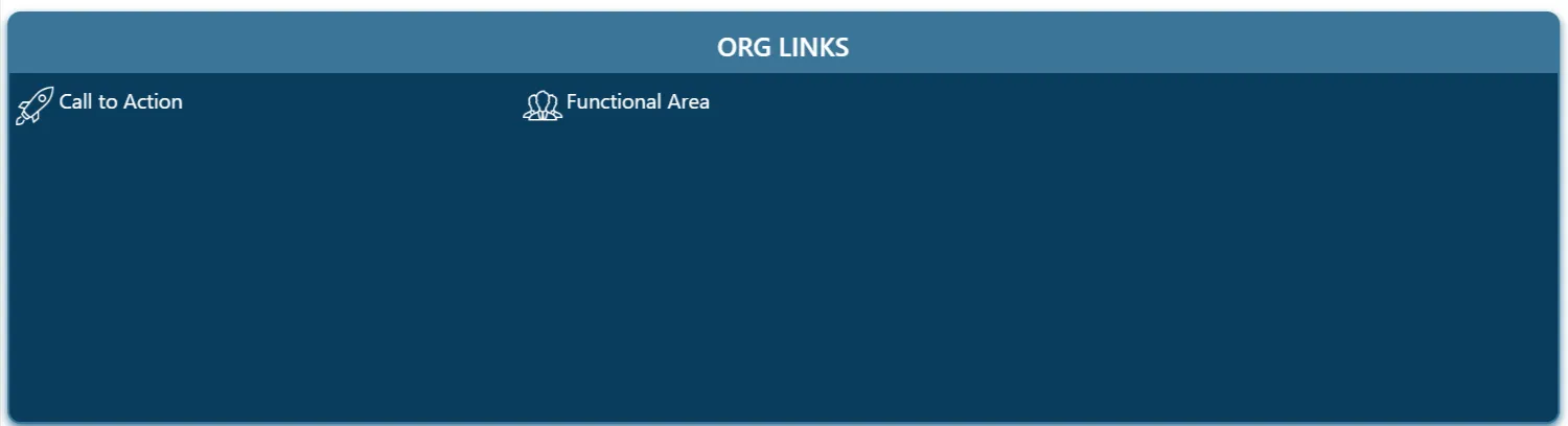
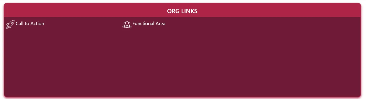
Organize and present key navigation links in a clean, professional layout. This component allows for easy access to frequently used resources and department pages.
- Count at Row: Set the number of links displayed per row.
- Background Options: Choose between solid colors, gradients, or image backgrounds for the component.
- Header Colors: Customize the color of the section headers to match your branding.
- Image Options: Use custom images or icons for each link tile.
Best suitable for:
- Department Navigation
- Quick Links Panel
- External Resource Hub
- Employee Essentials Launchpad
Stats Counter
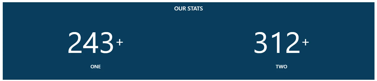


Showcase key organizational metrics, achievements, and milestones with dynamic counters. This visually engaging component helps celebrate success and keep employees informed about company growth.
- Counter with/without Image: Option to display a supporting image on the left side of the counter.
- Background Styling: Customize the background color or use a background image for the component.
- Header Counter Text Color: Full control over the color of the header and counter text.
Best suitable for:
- Company Growth Metrics
- Employee Milestones
- Project Achievements
- Sales and Performance Targets
